CXO Dashboard
A financial technology dashboard redesign that prioritizes regional revenue, clearer information hierarchy, and fast access to deeper business insights.
- My role
- UX / UI design
- Audience
- Business heads & executives
- Scope
- Analysis, architecture & visual design
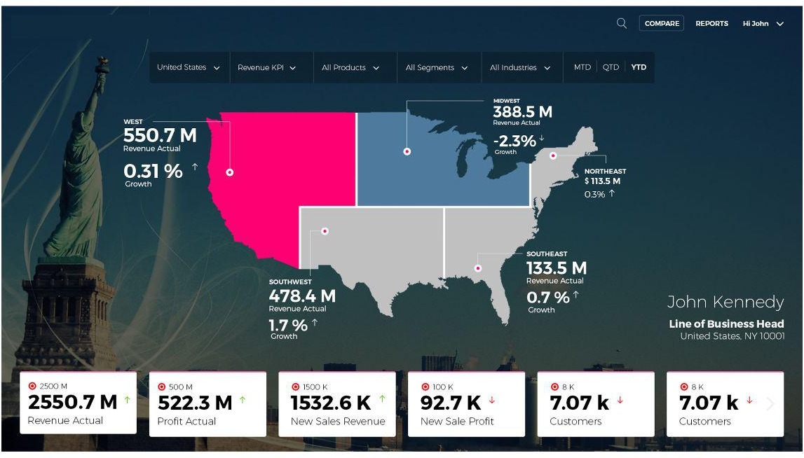
Original screens are reproduced from the supplied case study.
Why redesign?
The existing dashboard presented an overload of information without clear priorities. Navigation behaved like a filter, repeated filters and nested content made the structure hard to follow, and the experience did not reflect the daily tasks of its users.
The design goal
Help business leaders understand revenue, customers, and products at a glance, then move into the details needed to make informed decisions.
Core strategy
From understanding the context to shaping the experience.
Audit the existing experience
I reviewed navigation, data hierarchy, information grouping, trends, simplicity, and ease of access. The analysis highlighted missing prioritization and a confusing relationship between navigation and filtering.
Map the decision-maker
I mapped a Line of Business Head persona and their journey from login to logout. Daily tasks and pain points became a basis for deciding which information should be surfaced first.
Restructure the information architecture
I proposed a role-oriented structure for business heads, relationship-manager leads, and analysts, grouping relevant KPIs and reporting needs around their work.
Translate priorities into the interface
Regional revenue emerged as a primary concern for CEO / CIO users. I made the regional view central, supported by metric cards, consistent filters, and quick drilldowns.
A clearer overview-to-detail model
Annotated viewOverview
- 01Regional performance
Start with the geography that matters to the business decision.
- 02Metric cards
Scan related revenue, customer, and product information.
- 03Selected metric
Open a deeper statistical view from the overview.
Detail
- 01Drilldown
Inspect the selected category in more detail.
- 02Category switching
Keep other categories within reach without restarting.
- 03Executive concept
Explore a role-focused view for leadership needs.
The complete design story
A closer look
Prioritization, not simply a new visual skin
The existing dashboard placed many metrics on screen without a clear order of importance. The audit examined hierarchy, grouping, trends, ease of access, and the relationship between navigation and filters.
The resulting problem was structural: leaders needed a useful starting point and a predictable way into details. Rearranging the same information without changing that model would leave the main friction unresolved.
Anchor the structure in the business head’s work
The Line of Business Head persona and login-to-logout journey connect interface decisions to daily responsibilities. The architecture also considers relationship-manager leads and analysts, rather than treating the entire audience as one undifferentiated executive user.
Grouping information around roles and reporting tasks provides a clearer organizing principle than repeated filters and nested content. The original persona and architecture artifacts remain available in the page archive.
An overview that opens into detail
The landing design gives regional revenue greater prominence. Geographic context becomes the anchor for interpreting business performance, with supporting metric cards offering a fast scan.
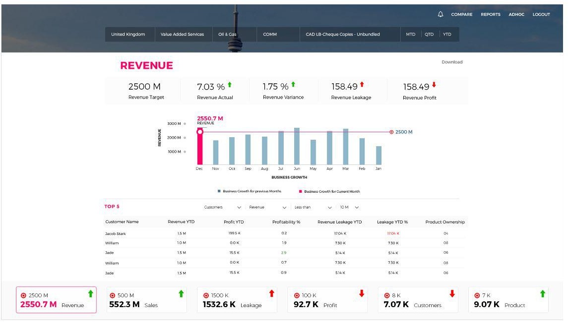
A selected metric opens a deeper view. Category switching remains accessible in the drilldown so that moving between related information does not require returning to the start.
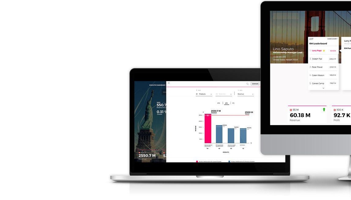
Explore a focused executive variant
The study also explores a more focused executive dashboard. This distinguishes a concise leadership overview from the information density that an analyst may need.
The source demonstrates interface and architecture deliverables, not a tested improvement in executive decision-making. Numbers visible in the designs are example dashboard content and are not outcome metrics.
Design decisions
The thinking behind the experience.
Lead with regional revenue
Rather than give every metric equal emphasis, I made regions the focal point. The map connects financial performance to the geography executives need to evaluate.
Separate overview from detail
Metric cards support a high-level scan and open a deeper view on selection. The drilldown retains access to other categories through cards at the footer.
Simplify the navigation model
I consolidated the navigation / filter approach and used map navigation to reach state-level information, addressing the ambiguity observed in the existing dashboard.
Design for different executive needs
I explored a focused executive dashboard concept for roles such as CIO and CFO, rather than assume that every decision-maker requires the same information.
What the work delivered
Delivered landing-page design centered on regional performance
Detailed metric views with cross-category navigation
Executive-level dashboard concept
The study documents the redesigned landing page, drilldown views, and an executive dashboard concept. These are design deliverables, not measured business results. No launch, adoption, or before-and-after usability metrics are reported; figures inside the screens are dashboard content, not redesign impact.
Read the original studyComplete source · 13 pages
Every page, in context