Healthy 365
I worked on Healthy 365 for 2.5 years as a Lead UX Designer in Singapore. This case study explores the product’s health and wellness experience, with research context drawn from a credited public account and newly written design analysis.
- My role
- Lead UX Designer · 2.5 years
- Audience
- Singaporeans across life stages
- Scope
- Health and wellness app · Singapore
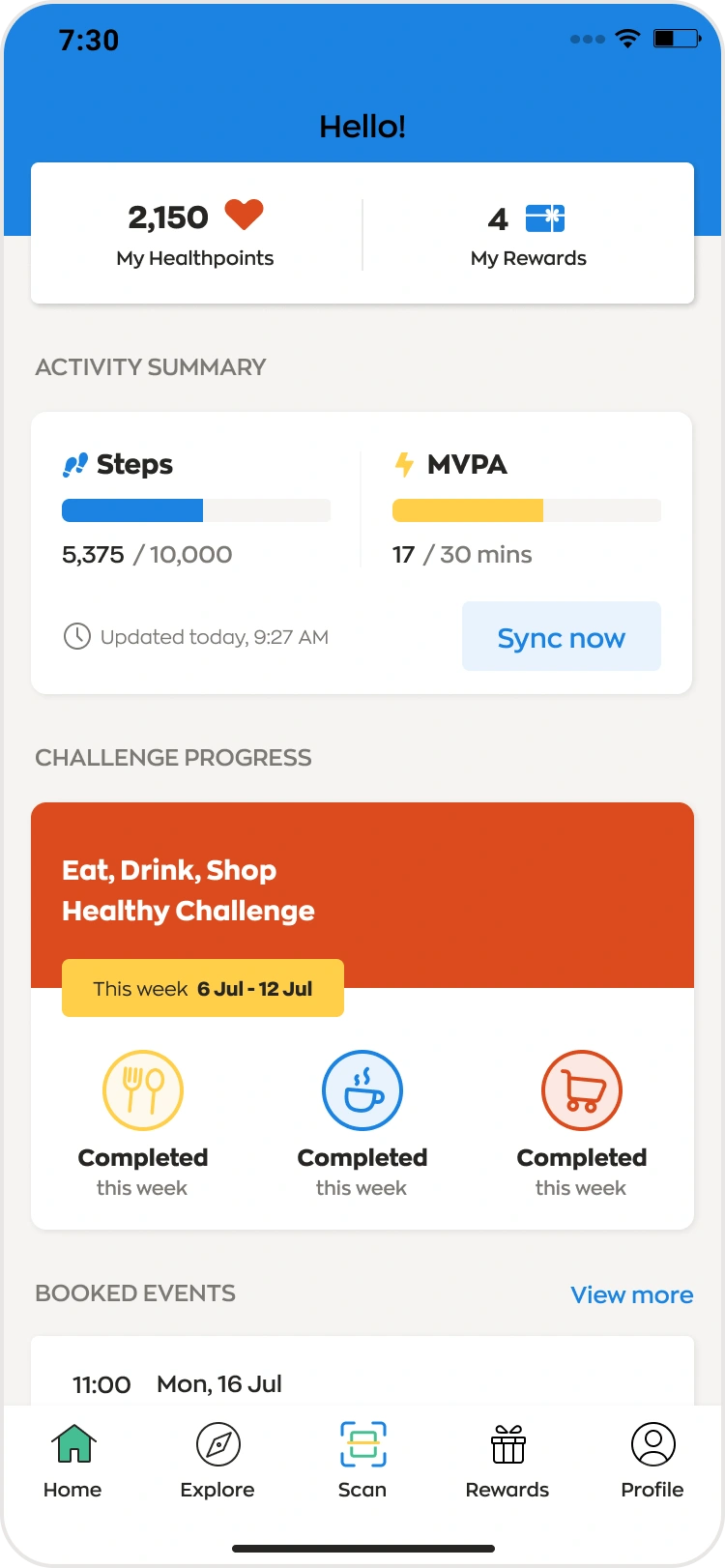
Research context and app visuals: Rajveer Singh Rathore’s public Healthy 365 case study. Original writing and explanatory diagrams. Confidential details remain excluded.
Why redesign?
The published project account describes difficult device synchronization, a slow health overview, and interactions that made routine tracking feel laborious. The opportunity was to connect daily health actions, useful feedback, and motivation in a more coherent mobile experience.
The design goal
Support sustainable health routines through clear entry points, relevant progress, understandable device states, and achievable next actions.
Core strategy
From understanding the context to shaping the experience.
Understand the daily context
The public research considers routines, life stages, motivations, and constraints rather than treating health tracking as an isolated task. These research activities are attributed to the published source, not claimed as my own.
Define a relevant product direction
The published approach connects research synthesis with stakeholder priorities and a product roadmap. Different life stages inform the relevance and accessibility of potential experiences.
Connect the core journeys
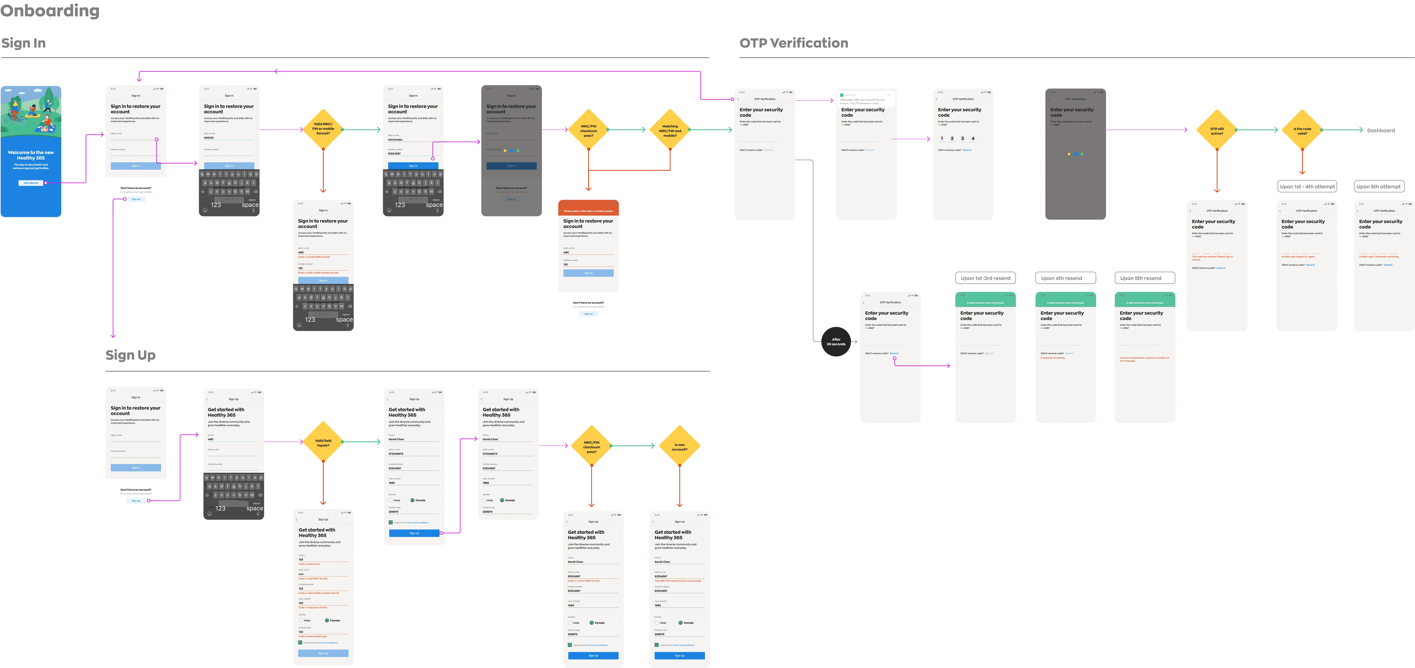
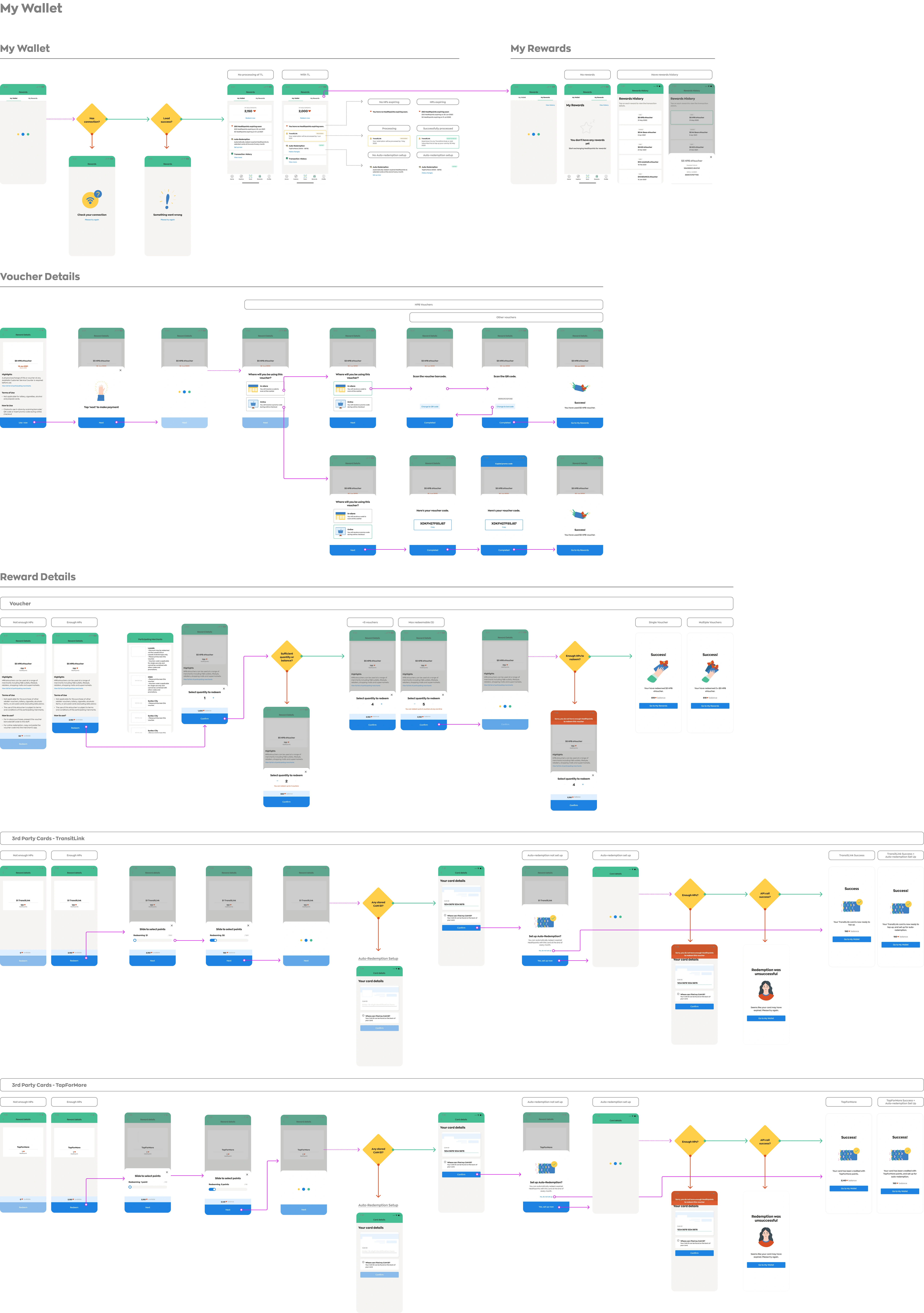
Onboarding, the health overview, device pairing, and rewards form the foundation of the documented experience. The annotated diagrams below explain how these journeys support a recurring routine.
Support consistent delivery
Reusable components and templates connect the design foundation to implementation. The public account documents collaboration and continuing delivery; my confirmed role was Lead UX Designer over 2.5 years in Singapore.
A repeatable health journey
Annotated viewCore experience
- 01Onboard + verify
Support new and returning users with clear entry states.
- 02Health overview
Make relevant progress and next actions visible.
- 03Connect a tracker
Explain pairing and synchronization states.
- 04Activities + challenges
Give daily effort a relevant, achievable context.
- 05Rewards
Connect progress with a clear reason to return.
Research themes translated into design questions
Annotated viewContexts
- 01Working adults
How can healthy choices fit limited time and shifting priorities?
- 02Parents
How can family routines and relevant guidance work together?
- 03Established + retired adults
How can visual guidance and achievable activity support confidence?
Shared design response
- 01Relevant guidance
Offer context that feels applicable to the person.
- 02Visible progress
Make effort understandable, with clear state feedback.
- 03Achievable next action
Encourage a sustainable routine instead of an all-or-nothing goal.
The complete design story
A closer look
Research context: everyday health competes with everyday life
The published account describes an app whose tracking, device synchronization, and information-heavy interactions made routine engagement difficult. The strategic challenge was to support everyday choices, not simply add more health measurements.
The public research considered life events, motivations, constraints, routines, and existing tools. Its reported interviews with 60 Singaporeans span younger people, working adults, parents, and older adults. Interview topics included health goals, influences, weekday and weekend routines, spending, device use, and experiences with the service.
The synthesis links competing career and family priorities to difficulty maintaining healthy habits. The opportunity is to offer relevant, feasible actions at different life stages rather than assume that every citizen has the same time, confidence, or goals.
From research themes to a product direction
The published approach moves through understanding, definition, exploration, and creation. It combines stakeholder alignment, journey synthesis, market context, concept exploration, and citizen feedback before shaping the product roadmap.
First jobbers, parents, and established or retired adults are considered as distinct contexts. Social encouragement, family-oriented knowledge, and accessible guidance are different responses to a shared need for support that fits daily life.
Concept exploration moves from a broad set of possibilities to more tangible prototypes. The reference reports focus-group evaluation and individual refinement; participant counts and results are not independently verified here.
My role: leading UX over 2.5 years in Singapore
I worked on the Healthy 365 app for 2.5 years as a Lead UX Designer in Singapore. This portfolio entry situates that experience within the broader product story while keeping publicly reported team research separate from my confirmed role.
The design discussion below explains the published experience and its rationale. It does not turn another designer’s first-person account into claims about my personal research, workshops, or individual ownership of the reproduced screens.
Architecture that supports a recurring health routine
The published foundation connects onboarding, a health overview, device pairing, and rewards. Together these create a recurring cycle: enter securely, understand current progress, capture activity reliably, and see the value of continuing.
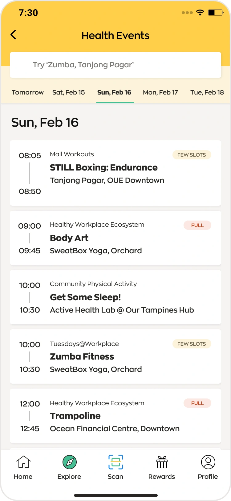
The health overview prioritizes relevant information rather than treating all features as equal. Events, challenges, and metric views use related templates, making different activities feel like parts of one product.
The annotated journey earlier on this page is an original simplified explanation of that experience, not a pixel-for-pixel reproduction of the published information architecture.
Design the states, not just the ideal screens
Onboarding accounts for new and returning users, verification, and error handling. The important design distinction is between entering the service for the first time and resuming a known health routine.
Device pairing needs comprehensible steps and recognizable progress. When activity data is delayed or a tracker is unreliable, the interface must communicate the state instead of leaving people to infer whether their effort was recorded.
Rewards connect progress to a next action. An understandable path from activity to reward is more useful than a visually prominent points total with no explanation of what it means. These are interpretations of the documented design direction, not new usability findings.
A shared foundation for delivery
The published design system brings basic styles, reusable components, and core templates together. Its value is operational as well as visual: teams can discuss states and variations through a shared vocabulary.
The account describes design–developer collaboration, documentation, story kick-offs, and regular showcases. Remote work during the pandemic added coordination constraints, making clear decisions and reusable patterns especially important.
This material describes the wider team’s delivery approach. It is not a personal claim about which meetings Abhishek ran or which components he authored.
Launch claims, continuing constraints, and responsible reporting
The public account describes launch and continued delivery, alongside tracker reliability, data integration, security, migration, and prioritization challenges. Launch is framed as the start of an ongoing service rather than the end of the design work.
The source contains inconsistent launch dates and usage figures between its introduction and launch section. For that reason, this portfolio does not repeat those dates, adoption percentages, or daily-use figures as verified outcomes.
The defensible takeaway is the documented design direction: a more coherent health experience supported by core journeys and a shared design foundation. Causal health improvements or individual business impact cannot be established from the reference alone.
Design decisions
The thinking behind the experience.
A useful starting point
Prioritize relevant progress and actions in the health overview rather than giving every feature equal prominence.
Make connection states understandable
Pairing and synchronization need recognizable steps and feedback so users can tell whether their activity is captured.
Link effort with motivation
Challenges and rewards connect activity with a clear next action. The design rationale is to encourage recurring engagement, not simply display a points balance.
Reuse patterns across journeys
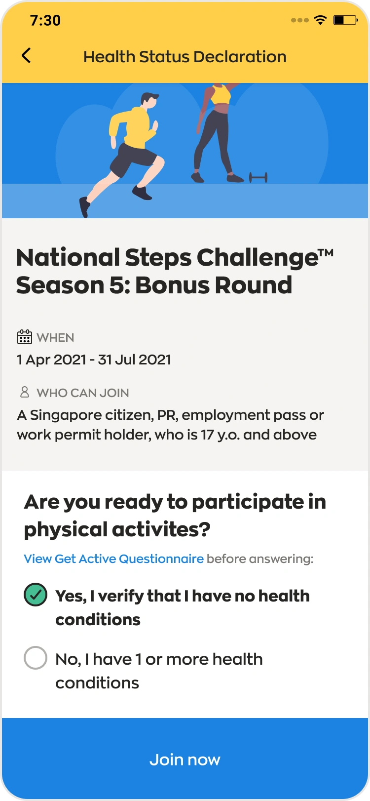
Related templates for dashboards, events, and challenges give the product a shared language while accommodating different content.
Related activity templates
What the work delivered
Abhishek’s confirmed Lead UX Designer engagement in Singapore
Onboarding, health overview, device pairing, and rewards documented in the reference
Reusable components and templates described in the public case study
The reference reports launch and ongoing delivery, but contains conflicting launch dates and usage figures. Those numbers are not repeated here as verified results. No causal health improvement or individual impact claim can be established from that account alone.
Sources & attribution
Research context and reproduced app visuals are attributed to the public reference. Abhishek’s confirmed contribution is his 2.5-year Lead UX Designer role in Singapore; the reference author’s individual research activities are not claimed as his. Writing and explanatory diagrams on this page are newly created.
Rajveer Singh Rathore’s published Healthy 365 case study