Automotive Financial Services
An online credit application for an automotive giant, designed to carry the familiarity of a dealership conversation into a clear, step-by-step digital experience.
- My role
- UX / UI design
- Audience
- Vehicle finance customers
- Scope
- End-to-end credit application
Images in the original automotive study are identified as illustrative.
Why redesign?
Vehicle financing asks customers to make complex financial choices and provide a substantial amount of personal information. The challenge was to bring this journey online without losing the context, guidance, and reassurance of the dealership experience.
The design goal
Keep customers oriented, make the finance structure easy to understand, and guide them from their vehicle offer through to a submitted credit application.
Core strategy
From understanding the context to shaping the experience.
Translate the dealership journey
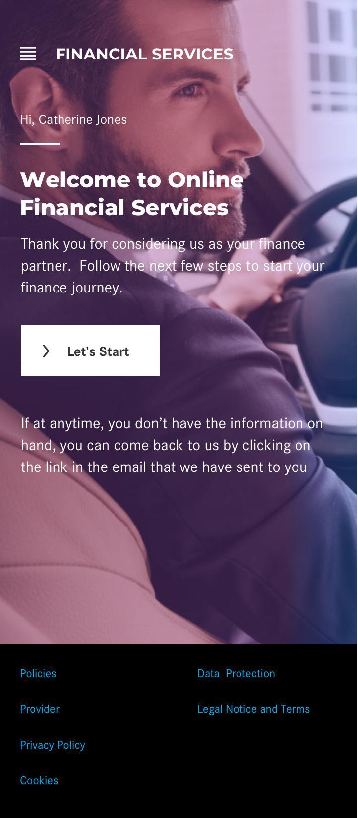
I used the handoff from salesperson to finance representative as the starting point. A personal welcome introduces the finance journey and explains that customers can return through an email link if information is not on hand.
Establish the financial context
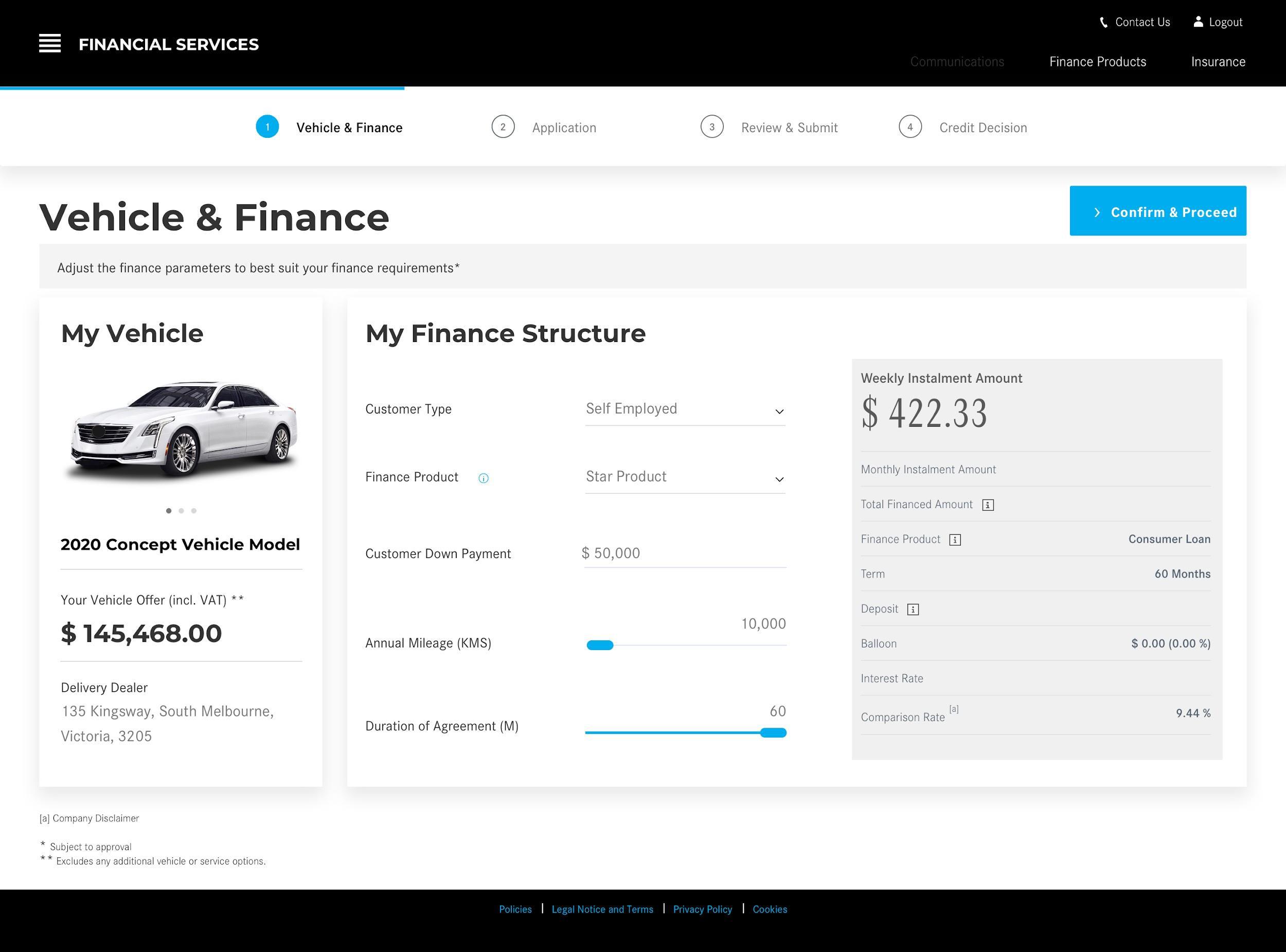
Vehicle details and the finance calculator sit together in one view. Customers can assess the offer, adjust finance parameters, and understand their instalment before continuing.
Break the application into sub-steps
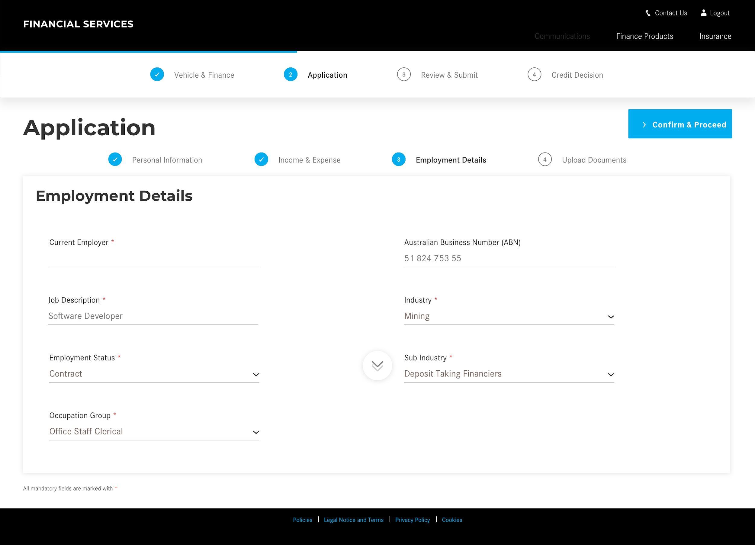
Personal information, income and expenses, employment details, and document uploads become separate sections. A journey bar preserves orientation across the wider application.
Close the loop
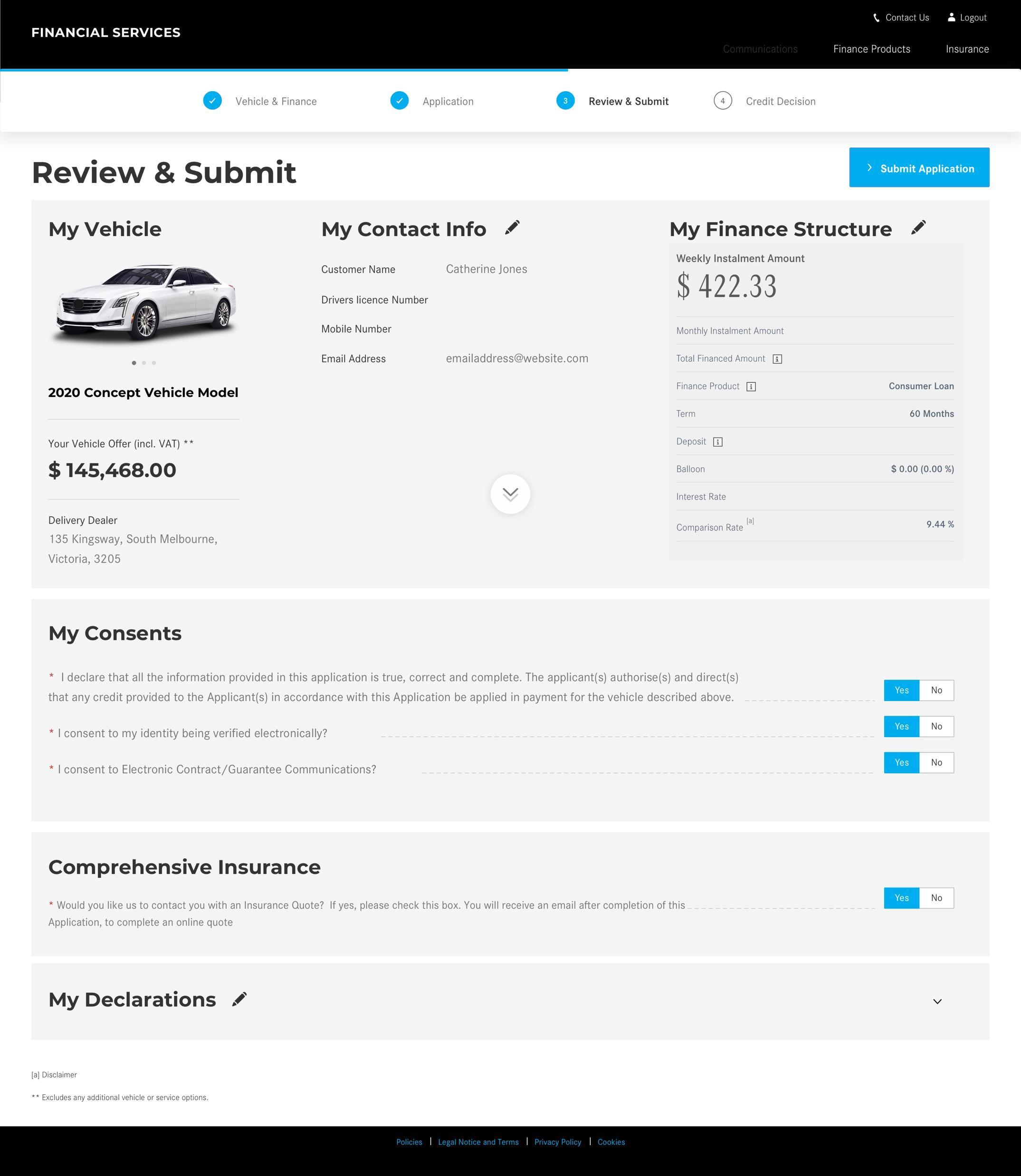
The review brings vehicle details, finance structure, declarations, and consents together. Confirmation supplies a reference ID and sets expectations for the next contact.
From offer to submitted application
Annotated viewCustomer journey
- 01Welcome
Continue the dealership handoff; return through an email link.
- 02Vehicle + finance
Review the vehicle offer and adjust finance parameters together.
- 03Application
Complete focused information and document sub-steps.
- 04Review + submit
Check the complete application and provide explicit consent.
- 05Confirmation
Receive a reference and understand the next contact.
The complete design story
A closer look
A dealership conversation, translated into a digital journey
The brief starts with a customer who already has a vehicle offer. Rather than ask them to restart the sales process, the application continues the dealership handoff into financing. A named welcome and a return-by-email option establish continuity before the form begins.
The opening pages set the project context and introduce the online credit application. The design is organized around the customer’s decisions: understand the offer, supply information, check the application, and submit.
Make the offer understandable before collecting information
The finance view combines vehicle details with the financing structure. Keeping these together lets customers assess their instalment and the parameters behind it without switching between disconnected pages.
Customer type and declarations precede the longer application. This establishes the relevant path and eligibility context before customers invest effort in providing their details.
A long application becomes a sequence of focused tasks
Personal information, income and expenses, employment, and supporting documents are treated as sub-steps. The wider journey remains visible, but the current screen asks for a manageable portion of the application.
Vehicle and finance context remain accessible beside the form. This preserves the relationship between the information being entered and the offer being applied for, rather than expecting customers to remember earlier choices.
Review, consent, and a definite next step
The review consolidates the vehicle, finance structure, and application details before submission. Consents are explicit, and the final action is separated from routine progression through the form.
The confirmation supplies an application reference and explains the next contact. Submission is therefore a visible state change, not just the disappearance of a form.
Responsive delivery and market adaptation
The mobile examples preserve the same sequence while adapting the presentation to a smaller screen. Customer-type selection and the welcome are shown as focused mobile experiences.
The source reports deployment in two markets and responsive development for iOS and Android. It also identifies market inputs, integrations, and validation rules as dependencies for further adaptation. These are documented delivery statements; the study contains no conversion or completion-rate comparison.
Design decisions
The thinking behind the experience.
One financial picture
I brought the vehicle offer and finance structure together instead of separating them, so customers can make choices with the full context visible.
Progress without overload
I divided the application into manageable sub-steps and used a prominent primary action. The aim was to reduce the burden of a long form, not simply make it look shorter.
Keep context within reach
An accessible side panel retains vehicle and finance details throughout the journey, while the journey bar lets customers return to earlier stages.
Confidence at submission
I included a consolidated review, explicit consents, and a clear confirmation. Customers leave with a reference number and an understanding of what happens next.
The same journey, on mobile

What the work delivered
Live deployment reported in the original study
Responsive journey designed and developed for iOS and Android
Designed for market-specific inputs, integrations, and validations
The original case study reports that the journey is live in two markets. Further adaptation depends on alignment with integration dependencies, local input parameters, and system validations. Completion-rate, conversion, and usability metrics are not included in the source study.
Read the original studyComplete source · 13 pages
Every page, in context