Order Management
A UX design study for Dell’s GCMP order-processing and management application. The work combines platform discovery, persona and task mapping, a heuristic review, and seven interface concepts to find a more coherent operational workspace.
- My role
- UX design
- Audience
- Order processors & platform teams
- Scope
- Heuristic evaluation, architecture & concepts
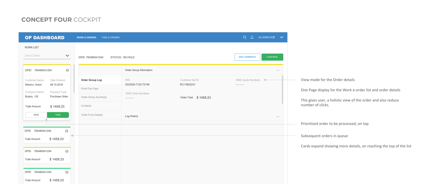
Original concept wireframes, not final UI. Source icons, illustrations, and animations are representative and require rights clearance for reuse.
Why redesign?
Order processors faced multiple pages and tabs for simple tasks, layered navigation, substantial cognitive load, and long processing times. The heuristic review also identified unstructured information architecture and inconsistent layouts. Improving operational efficiency was a design objective, not a measured result.
The design goal
Bring the work queue and order context closer together, reduce unnecessary navigation, and help teams locate the information they need to process an order.
Core strategy
From understanding the context to shaping the experience.
Establish a shared operational vision
Knowledge-transfer sessions and a workshop brought product owners, managers, and technology teams together to understand the platform and align on an intuitive, efficiency-led direction.
Understand the order processor’s work
I mapped user segments, personas, task flows, and the journey from login through checking and updating an order. This connected the design direction to the responsibilities of processors and the broader platform team.
Audit the structure and navigation
The heuristic evaluation identified multi-level navigation, information grouping, and layout issues. I then proposed role-based information architecture and explored patterns such as quick drilldowns and comparison views.
Compare seven ways to organize the workspace
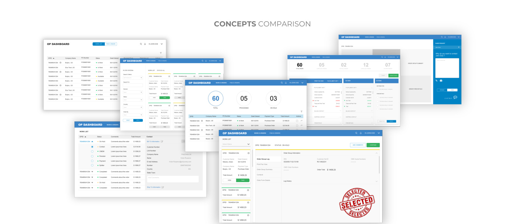
I explored tabular, card, status, cockpit, compare, levels, and chatbot concepts. The source records a concept comparison and team feedback, with the Airplane Cockpit approach selected for further development.
Order investigation with an exception loop
Annotated viewProcess
- 01Worklist / find order
Select an assigned order or locate one using filters.
- 02Inspect + compare
Review comments, addresses, PFV / GII, and configuration.
- 03Payment + duplicate checks
Check credit and other payment parameters; inspect PO duplication.
- 04Update disposition
Resolve the order as Complete, On Hold, or Cancel.
Exception loop
- 01Missing or inconsistent data
Identify the detail that prevents completion.
- 02Contact sales
Request clarification or information from the customer.
- 03Correct + recheck
Update GII and return to investigation before disposition.
The selected cockpit arrangement
Annotated viewPersistent context
- 01Prioritized queue
Keep the next order visible and the current order at the top.
- 02Current order details
Bring operational context beside the queue.
- 03Focused comparison
Surface mismatches and retain access to status and filters.
The complete design story
A closer look
One operational workspace across multiple modules
The GCMP vision brings order processing and related modules into a coherent workspace. Knowledge-transfer sessions and a design workshop align product owners and technology teams on the existing platform and the direction for redesign.
The source highlights slow loading, lengthy order handling, complicated navigation, and unstructured information. Reducing clicks and increasing operational efficiency are objectives. They are not presented here as measured redesign results.
Understand who owns the work and who supports it
User segmentation distinguishes the order processor, administrator, product owner, frictionless team, and principal developer. The module relationship view maps those responsibilities to E-Order, Core Studio, Smart Swap, Configurator, Diagnostics, Test, Admin, Dynamic Rules, and the Order Journey Dashboard.
The order processor is the central operational user: they find or take orders, inspect details, compare PFV with GII, update information, and resolve missing data with sales. Developer and product-owner personas describe feasibility, release coordination, and quality responsibilities.
Persona workload and handling-time figures in the source characterize the existing scenario. They are baseline descriptions, not evidence that the proposed design improves throughput.
Follow an order through investigation and resolution
The task flow starts with a worklist or a found order, then moves through comments, shipping and billing details, configuration, payment, credit, and duplicate-order checks. Missing information or doubts send the processor back to sales rather than directly to completion.
The journey includes comparing PFV and GII, correcting errors, updating status, changing disposition, and tracking processed orders. Cancel, Complete, and On Hold are documented status outcomes. The redesigned workspace must make this context accessible throughout the task.
Audit before choosing a design direction
The heuristic evaluation examines the layered navigation and information grouping of the existing E-Orders experience. Proposed architecture and design directions explore quicker access to relevant details and a more coherent arrangement of the work.
The strategy pages consider trend references and value additions. These are inspiration and proposed capabilities, not implemented features. The original pages preserve the complete architecture and audit detail.
Compare seven organizational models
The concepts explore tabular, card, status, cockpit, compare, levels, and chatbot-based approaches. The comparison is about how the same operational work is organized, not seven separate shipped products.
The Airplane Cockpit direction combines the queue with details of the current order. Keeping upcoming orders visible supports continuity, while comparison views explore how mismatches can be isolated without repeatedly switching between systems.
Concept feedback and selection are documented in the supplied material. Wireframes remain provisional: the source specifically asks readers not to evaluate them as final typography, color, spacing, or content.
Selection is followed by a concrete refinement plan
The team selects the cockpit direction for further development. Feedback calls for visible filters and status access, comparison focused on mismatched information, and clearer handling of the prioritized queue.
The source requests a follow-up wireframe at the real 1366 × 768 resolution with realistic data to check available space. Pagination is preferred over lazy loading. These are next-step requirements, not the results of an implemented or measured release.
Design decisions
The thinking behind the experience.
Unite the queue and order details
The selected cockpit concept presents the work list alongside the current order’s details. Its intended benefit is a more complete view with less movement between pages.
Keep the next order in context
The cockpit places the prioritized order at the top of the queue and expands cards as they reach the top, while keeping subsequent orders visible.
Surface filters and comparison
Team feedback called for upfront filters, easy access to status filters, and comparison focused on mismatched content. These are documented refinement directions, not verified usability improvements.
Validate the available space
The team requested a follow-up wireframe at the actual 1366 × 768 resolution with realistic data to check space utilization, and preferred pagination over lazy loading.
What the work delivered
Alternative order-processing workspaces explored and compared
Documented team selection of the Airplane Cockpit direction
Team feedback on filters, comparison, queue handling, and screen space
The study records a selected concept, supporting architecture, wireframes, and team feedback. It does not report implementation, launch, or quantified efficiency gains. Fewer clicks and faster order processing remain intended benefits. The source asks readers not to evaluate the wireframes as final visual design; typography, colors, spacing, and some content are provisional.
Read the original studyComplete source · 47 pages
Every page, in context